Friday, February 24, 2012

Kat Von D True Romance Poetica Eyeshadow Palette Review and Swatches


Here are the swatches from the Kat Von D True Romance Poetica eyeshadow palette. Sorry, my arm is gross and has freckles! From left to right: "Forgiveness" a super shimmery white with gold sparkles in it. I couldn't see the gold at all in the pan until I swatched it and I was very surprised at how much gold is actually in it! "Sand Timer" is a light shimmery sand/greige, that almost doesn't show up on my skin. "Chandler" is a super reflective rust, which I think is my absolute favorite in this palette. "Tijuana" is a black with purple and rust colored micro glitter. "Wonderland" is a glittery dark purple with light purple micro glitter.  "Shiba" is a greyish purple with the same light purple shimmer as "Wonderland". "Babe" is a super bright purple with an iridescent blueish sheen to it. This is my second favorite, because I love bright colors, but don't have any with a sneaky iridescent finish to it. And last but not least "You Alone" is the most matte of the bunch, a creamy off white, leaning on the beige side, having only the slightest bit of shimmer to it. Almost not even qualifying as a shimmery eyeshadow. It's an in-betweener. I think "You Alone" would be the perfect color in this palette to use as a base color from lashline to brow. 
 
Above: With Flash
Below: Without Flash
As for what I think: Not going to go into detail reviewing each shadow, but I'll just tell you what I think of the palette as a whole. First of all, I love the packaging. The outside panels are a cool matte metal with an embossed design and has a great weight to it. The inside has a huge mirror the size of the whole case and the eyeshadows are a large and generous pan size. It has a little well for the Kat Von D "Autograph Pencil" which is a super black eyeliner pencil, included in the set. The quality of the pencil is very smooth, creamy, and blacker-than-black. I have nothing bad to say about the eyeliner really, however haven't tried it out so can't report on its staying power or smudging. Some shadows are "better" than others and I can say that they are all really pigmented, they blend easily, they are interesting and fun colors, but the one bad thing is there is quite a bit a dusty fall out on most of the shadows. And I believe I'm losing quite a bit of product each time  I dip a brush into a shadow. I give it a 4 out of 5. There's a range of colors to make multiple different looks and they're pretty good quality blendable shadows. Other than it does create a fair amount of fallout, maybe that's why they give you pretty large pans of each color! :)
 This was given to me as a gift from my boyfriend's mom who gives pretty trendy gifts. Thank you!

Tuesday, February 21, 2012

Pink Glitter & White French Mani

Classic pink & whites with a twist! I accidentally grabbed my sparkly pink glitter vomit mix instead of my regular clear pink I use on my nail bed. There's all kinds of glitter in there: pink metallic tinsel, pink and purple dust glitter, iridescent hexagons and stars. Basically the kitchen sink. I placed the white cut out acrylic tips sort of lower on my nail bed than I usually would so it has room to grow out for a couple weeks. I used Krazy Glue to adhere my tips on and it was so bad! It took forever to dry! I only put my acrylics back on because I had found a fresh bottle of Krazy Glue in my craft box and I have been out of glue for over 2 months now! Well, that's all folks, and prolly for a little while unless I feel inspired to dress up these nails enough to post!

Sunday, February 12, 2012

Last Vday Mani (#5) Heart Stamping and Argyle

This last mani for Vday has a little but of everything. My base color was a bright pink Dream Poppy by Wet N Wild. I used that color with a bit of white mixed in to make the triangles of the argyle accent nail and for the stamped hearts (m03). And silver striping tape cut to make the lines for the argyle. *So over Valentines Day already*

Saturday, February 11, 2012

Valentines Mani #3 and 4- Heart Print

So I grouped these two nail designs together because both of them have a heart print design made from a dotting tool. The first is the NYC crooked "O" LOVE sculpture painted in Dream Poppy by Sally Hansen, on top of a base coat of Raise Awareness by Essie. The other is basically the same dotting tool heart pattern on a French. I can't write much because I'm on my phone so I'll edit and update later with the colors and more instructions. Sorry, readers <33333

Thursday, February 2, 2012

Valentines Mani #2: Jungle Funky French

This wasn't what I had in mind when I sat down to do a second valentines mani- it just happened. It's a super sparkly animal print funky French that had tiny pops of pink (it looks purple but it's pink) inside the cheetah print. I used metallic pink hexagon glitter to and outlined it in black to make a cheetah print. Underneath this is a white French tip, covered in Metallica by Wet n Wild, with an unnamed silver glitter on top of the silver part. Then I added a black zebra. It's fun, sparkly and is definitely a contender for actual Valentines day nails.

Wednesday, February 1, 2012

Valentine&apos;s Day Mani #1!!

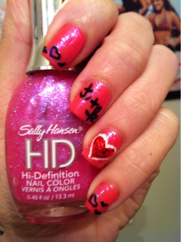
Ahhhh.... Valentines Day... One of my favorite holidays because I love pink and hearts! Hopefully, I'll get flowers for that vase I got for Christmas (wink, Kevin!! ;) so here is my first mani for Vday! I painte on 2 coats of Blazed by Wet N Wild, and a coat of LCD by Sally Hansen HD. I then used a dotting tool to make white dots that touch in the shape of a heart on my ring finger. I filled this in with red striper polish, and used clear coat and a dotting tool to cover the red part of the heart in 1mm red hexagons. I used a black polish to paint on the "T+K" carefully and added black heart cut out decals to match! The T+K stands for Tina plus Kevin! Tina plus Kevin Forever! ;)